Hello, world!
This is a simple hero unit, a simple jumbotron-style component for calling extra attention to featured content or information.
It uses utility classes for typography and spacing to space content out within the larger container.
Learn more-
List-based media object
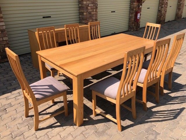
Cras sit amet nibh libero, in gravida nulla. Nulla vel metus scelerisque ante sollicitudin. Cras purus odio, vestibulum in vulputate at, tempus viverra turpis. Fusce condimentum nunc ac nisi vulputate fringilla. Donec lacinia congue felis in faucibus. -
List-based media object
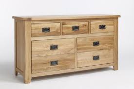
Cras sit amet nibh libero, in gravida nulla. Nulla vel metus scelerisque ante sollicitudin. Cras purus odio, vestibulum in vulputate at, tempus viverra turpis. Fusce condimentum nunc ac nisi vulputate fringilla. Donec lacinia congue felis in faucibus. -
List-based media object
Cras sit amet nibh libero, in gravida nulla. Nulla vel metus scelerisque ante sollicitudin. Cras purus odio, vestibulum in vulputate at, tempus viverra turpis. Fusce condimentum nunc ac nisi vulputate fringilla. Donec lacinia congue felis in faucibus.

Card title
This is a longer card with supporting text below as a natural lead-in to additional content. This content is a little bit longer.

Card title
This is a longer card with supporting text below as a natural lead-in to additional content. This content is a little bit longer.

Card title
This is a longer card with supporting text below as a natural lead-in to additional content. This content is a little bit longer.
Card title
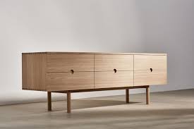
This is a longer card with supporting text below as a natural lead-in to additional content. This content is a little bit longer.
Card title
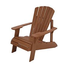
This is a longer card with supporting text below as a natural lead-in to additional content. This content is a little bit longer.
- Desk
- Table
- Chair
- Wood
